I initially posted this issue in the ARCCSS slack, but I am reposting here in case this may be useful to someone else:
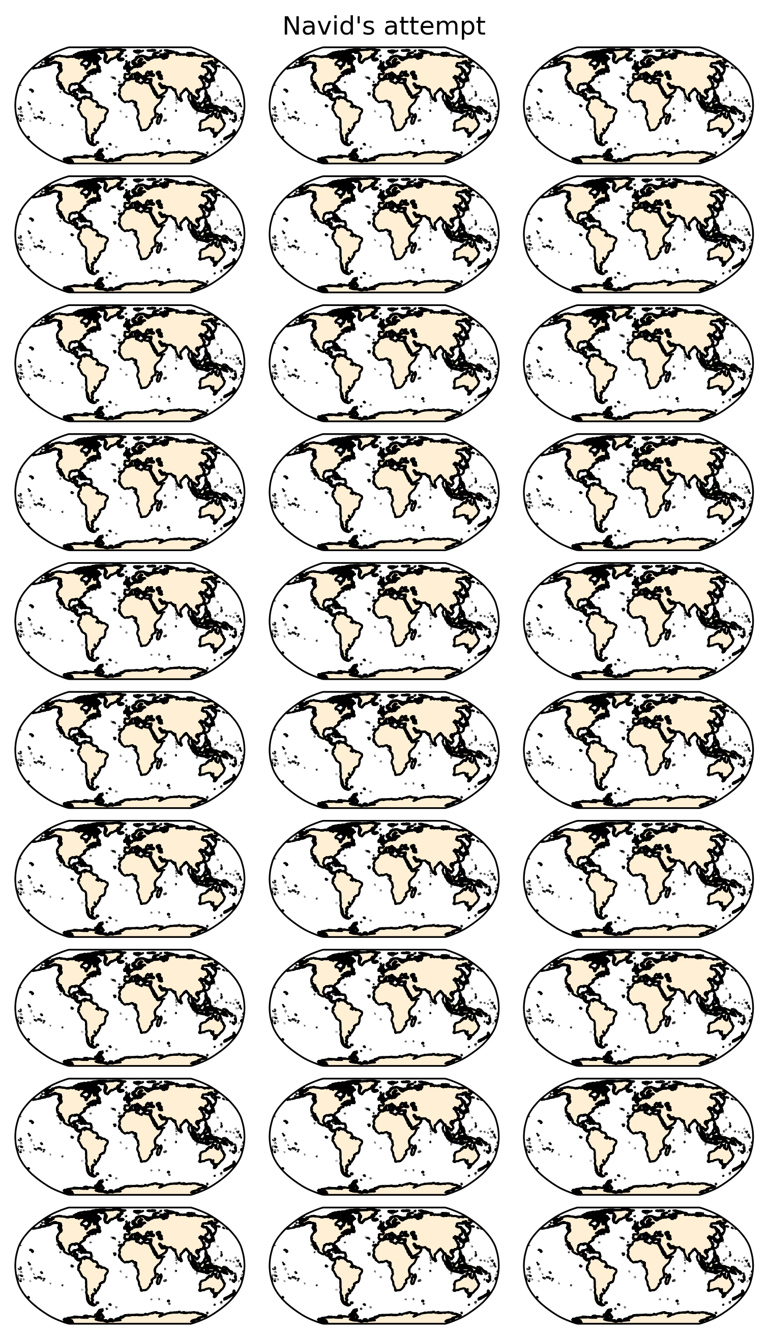
Hello everyone! I have a bit of an issue when plotting projected maps in a grid. I am using CMIP6 outputs from various models and I want to present all results in the same figure. All maps are plotted using matplotlib and cartopy , but for some unknown reason, there is an impressive amount of white space between maps and I cannot understand what the problem is (see figure below).
I have used gridspec and subplots , but they both have the same issue. I have tried changing the aspect of each map, the space between each map, applying a constrained and tight layout, adjust the figure size, remove the colorbars (once of which is shared between two columns), but nothing seems to solve the issue.
Below is the latest attempt at getting rid of the white space:
fig, axs = plt.subplots(len(models), len(decadeName), subplot_kw = {'projection': ccrs.Robinson(), 'aspect': 0.75}, gridspec_kw = {'wspace': 0.0, 'hspace': 0.1}, layout = 'constrained',
figsize = (15, 11.25))
for i, mod in enumerate(models):
  x = data[mod].sel(month = month_plot)
  for j, dec in enumerate(x.decade.values):
    #Add land and coastlines
    axs[i, j].add_feature(land_50m)
    axs[i, j].coastlines(resolution = '50m')
      if j < 2:
      p1 = x.sel(decade = dec).plot.pcolormesh('lon', 'lat', ax = axs[i, j], transform = ccrs.PlateCarree(),
      cmap = cm.cm.speed, vmin = min_intpp, vmax = max_intpp*0.9, add_colorbar = False,
      norm = mcolors.PowerNorm(gamma = 0.5))
    else:
      p2 = x.sel(decade = dec).plot.pcolormesh('lon', 'lat', ax = axs[i, j], transform = ccrs.PlateCarree(),
      cmap = mymap_diff, norm = divnorm_diff, add_colorbar = False)
    axs[i, j].set_title('')

cb = plt.colorbar(p1, ax = axs[i, 0:2], use_gridspec = True, orientation = 'horizontal',
                  shrink = 0.75, aspect = 30,
                  label = 'Primary Organic Carbon Production (mol m-2 s-1)')

cb_dif = plt.colorbar(p2, ax = axs[i, -1], use_gridspec = True, orientation = 'horizontal',
                      shrink = 0.9, label = 'Difference (mol m-2 s-1)')

fig.suptitle(f'Mean {month_plot} values', y = 1.0)
A solution that was offered was to change the figure size, but this has not helped.